Sensible Design: making ethically personalized digital products
March 30, 2020

I’m writing this during a global pandemic where the world has come to a stop. For the time being, we’re relying on technology to go about our daily lives. Now more than ever it’s worth taking a look at our relationship with technology and how its makers can shape it to serve the needs of its users.
The way we relate to technology is constantly evolving — in less than a decade we’ve seen content move from newsstands, to our laps, hands, and soon directly into our eyeballs. This is why I’m a big believer in future-proofing design. This usually means learning new tools and platforms, like 3D and motion design. However, we are at the precipice of something much deeper than that: how we define the inner workings of the products we bring to the world.
After spending the last decade exploring the future of technology and how we relate to it — from virtual reality to connected cars and new storytelling formats — one thing has become increasingly clear: people are growing increasingly distrustful of technology.
Privacy leaks and existential threats to democracy cause people to think twice about downloading your next app. The big tech companies continue to exploit people’s fear of missing out and social anxieties. We’ve created (or at the very least, contributed to) vicious cycles that rely on addictive behavior loops, leaving people feeling lousy if they choose to participate in the world of technology. So, what options are they left with? Disconnect completely, meditate and throw their phone into the sea, I guess.

Like this, but Simba is your iPhone.In 2019, I joined Canopy to build an alternative to this reality. Our theory is that the way personalization works today has played a key role in the damage caused by technology. But it doesn’t have to be this way. There’s a more ethical and mindful alternative to building personalized products and we call it Sensible.
Sensible is a set of principles for software engineers, designers, and product makers to build technology that respects people’s agency and privacy when using digital products.
I’d like to share what we mean by that and how we’ve applied those ideas into our first consumer app, Tonic. But first, how did we get here?
How we f*cked up
We think this all started with the Web 2.0, about fifteen years ago. For those of you too young to remember, “The Web 2.0" term was invented by Darcy DiNucci in 1999 and later popularized by Tim O’Reilly and Dale Dougherty in 2004 and it referred to the idea that the internet should enable people to create and share their own content with others. This paved the way to online communities that enabled a lot of creativity and self expression (yay!) This trend was accelerated by the rise of the iPhone and other smartphones, which lead to an exponential growth in the amount of user-generated content online.
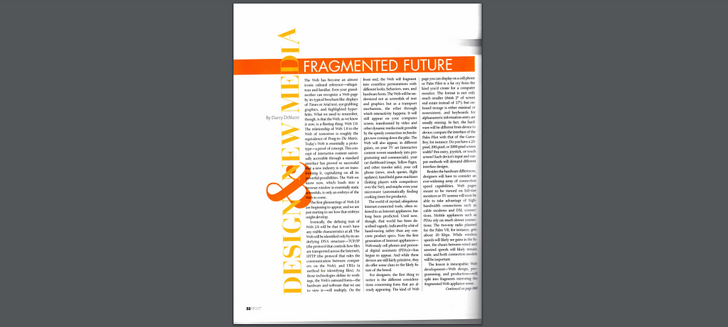
Darcy DiNucci’s Fragmented Future article on Print Magazine, which introduced the term Web 2.0Viral moments proliferated and the internet as we know it started to take shape. These platforms found themselves with more content than any single person could consume. Naturally, companies turned to personalization algorithms to show only the interesting bits to their users. At the time, the only way they knew how to do it was by collecting a bunch of personal data and uploading it to their servers to train their algorithms. This was powered by what we now know as the cloud.
Then, a business model developed where companies packaged and resold this data in bulk so advertisers could better target across platforms. To measure the success of these models, companies began optimizing for engagement: the more people interacted with their products, the more valuable they thought they were.
So the cloud, business models, and engagement metrics led to a misalignment of incentives between product makers and users. As a result, every website or app now asks for your email, phone number, or even your credit card in exchange for a marginally better user experience.
User data is trafficked without our explicit consent. Companies use this data to create an assumption of who we are on the web. To top it all, we can’t change or escape that assumption. It’s as though every time we popped into our local bodega to buy a loaf of bread, they checked our ID and reviewed our purchase history. What looks like a bodega, is actually an MRI.
This has become the price of admission for the internet.
A shift in demand
We’re noticing a shift in what people demand from their digital products. People are moving away from public spaces like social media and into slower and more private mediums like email newsletters and podcasts.

A dude and his podcast, by Unsplash.According to The Podcasts Trend Report, 2019 was the first year where the majority (59%) of their 1200 respondents spent more time listening to podcasts than on social media. And over 82% of them listened to podcasts for more than 7 hours each week.
There’s a clear increase in the demand for an alternative way to deliver and consume information online and product makers need to adapt the way they build products to meet this demand. Sensible, is our response to that.
What is a Sensible Product?
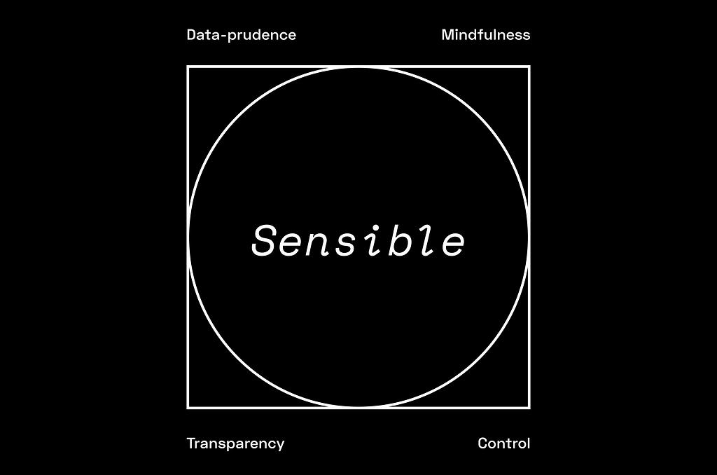
Sensible products are data-prudent, mindful of their users’ time and attention, transparent, and give users top-level control of the experience.
Data Prudent
Never ask for more data than you need, which it turns out is far less than you may have been led to believe.
Mindful
Respect people’s time and attention and never aim to covertly or overtly hijack it. Never artificially obfuscate the underlying design patterns that give rise to your functionality.
Transparent
Always clearly explain, in human terms, how the sausage is made. Users should, to the furthest extent possible, be able to articulate how your product works.
Controllable
Take every possible measure to ensure users remain aware of and in control of the data they share. Build into the core experience the ability to correct misaligned recommendations and rescind any data that has been shared.
We’ve noticed a few products adopting some Sensible principles as they introduce new features. For example, Instagram’s “You’re all caught up” feature is Mindful and Transparent, even though the rest of the product isn’t.
Although it’s encouraging to see products adopt some of these principles, we asked ourselves if we could design a consumer product that provided personalized recommendations while touching on all Sensible principles; our first stab at this was Tonic.
Meet Tonic
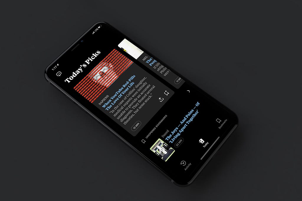
Tonic is an iPhone app that gives you a selection of personalized reads every day. We combine machine learning and editorial input to find the unexplored parts of the web and deliver five articles that are meant to delight and inform you. Here’s how we used Sensible principles to guide the design of Tonic:
Data-prudence
First, we wanted to make sure that we could deliver personalized content you would love without asking for more data than necessary. We did this by using a technique called Differential Privacy.
Differential Privacy is defined as “a system for publicly sharing information about a dataset by describing the patterns of a group while withholding information about the individuals.” This is a practice spearheaded by many engineers and scientists who are far more qualified to explain how it works than I am (but I’m going to try anyway!).
In Tonic, we basically create a version of what you’re into based on your activity with the app — what you choose to tap on, how long you spend on an article, etc — then we add “noise” to make it mathematically impossible to decipher who you are and we send that to the server. Once we’ve delivered your recommendations, we throw that noised representation away instead of storing it permanently.

This approach is only made possible recently given the advancements in computing power on newer mobile devices, but what this means is that there is no longer a necessity to collect your personal data in order to deliver personalized experiences you will love.
In fact, we don’t even ask you to log in when you download Tonic (I know. Crazy, right?!). You can just download the app, go through a quick onboarding and start using it right away.
This means that we don’t know anything personally identifiable about any of our users, but only information about them in aggregate. We have no way to know their name, where they’re from, or how much time they individually spend on our app unless they choose to share that information with us.
Feedback
This provided a unique challenge for understanding how to design for our audience. We have no way to target a specific user and learn from their behavior without their consent. So, we decided to lean in to user feedback and create a direct channel to our team.
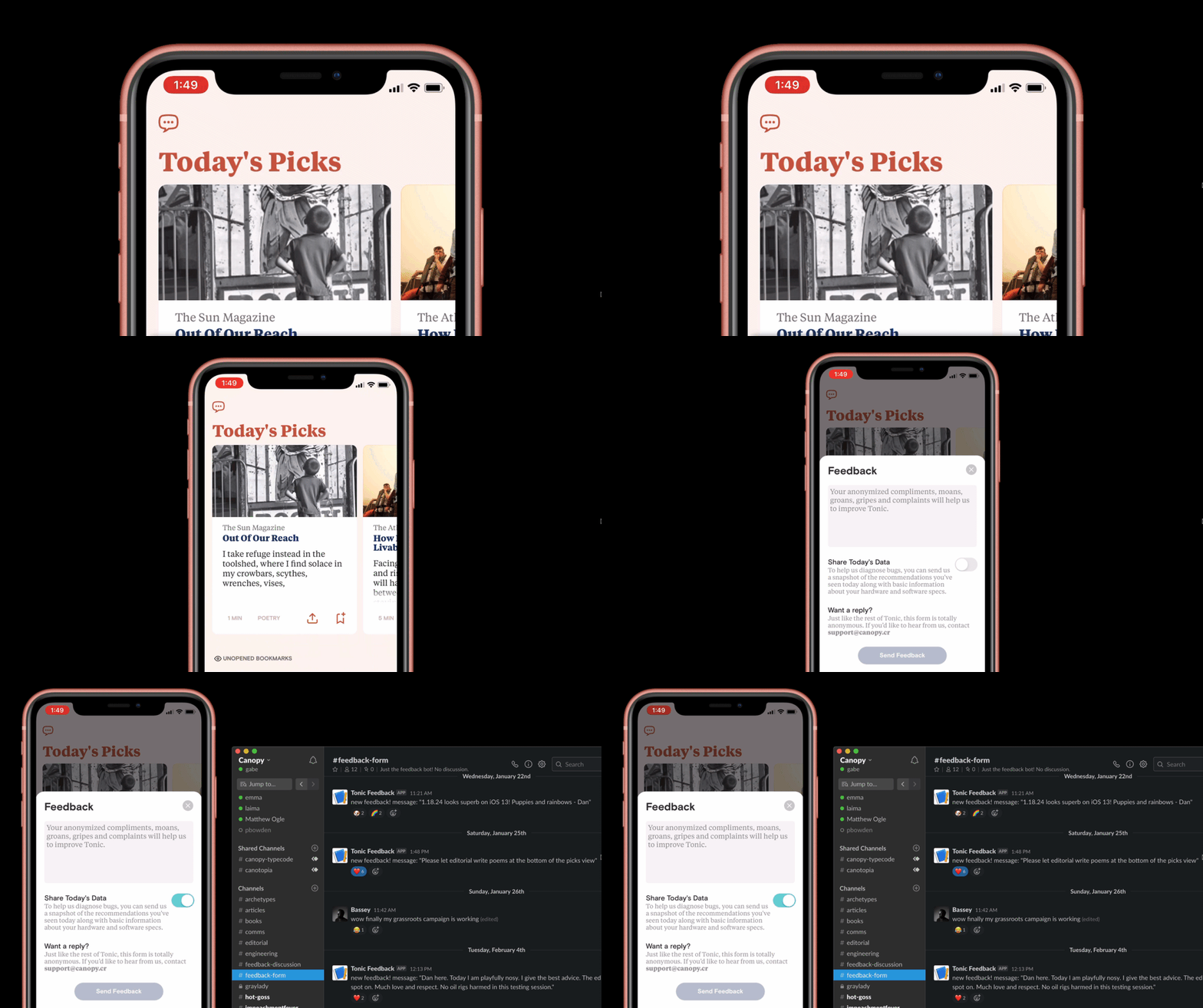
We put a feedback button in the main screen that, when tapped, it allows any user to send an anonymous message directly to our Slack. It’s a wonderful window into our users’ minds. We regularly get messages from users who love and hate our app and most importantly WHY they do.
The great thing about it is that, even though we are a small team and don’t have the resources for an entire research department, we all get to see how our users feel about the product we’re building. That includes engineers, product, design, marketing, and every other area of the company that is typically not exposed to this level of user insight.
Mindfulness
We knew we wanted to avoid FOMO that made you overwhelmed every time you open the app. There are already a lot of bottomless lists of content on the internet and we didn’t want to just add to the noise.

We created a constraint: instead of an infinite feed of content, we’d limit it to five recommendations every day and aimed for quality over quantity. This made the app feel fresh and gave you a reason to come back every day, without having to rely on growth hacks to bring you back.
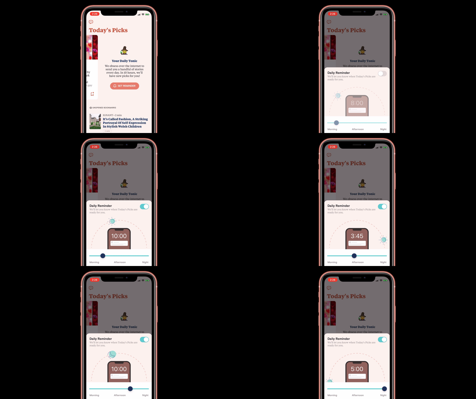
Optionally, we can remind folks when new recommendations are ready. Of course, people can choose when the notification is sent. This was an opportunity to delight people while reinforcing the idea that they remain in control of every part of the experience.
Transparency
Most recommendation systems are a black box. How many of us can describe how Instagram’s Explore page actually works? We wanted to peel behind the curtain with Tonic and give people a clear sense of what we think they’re into and more importantly, what information we use to inform that.
Activity
One of the three tabs in the app is dedicated to your Activity. Tonic users don’t have to go hunting for it behind a menu in Settings. What they’ve done in the app is right there, visible next to the home screen.
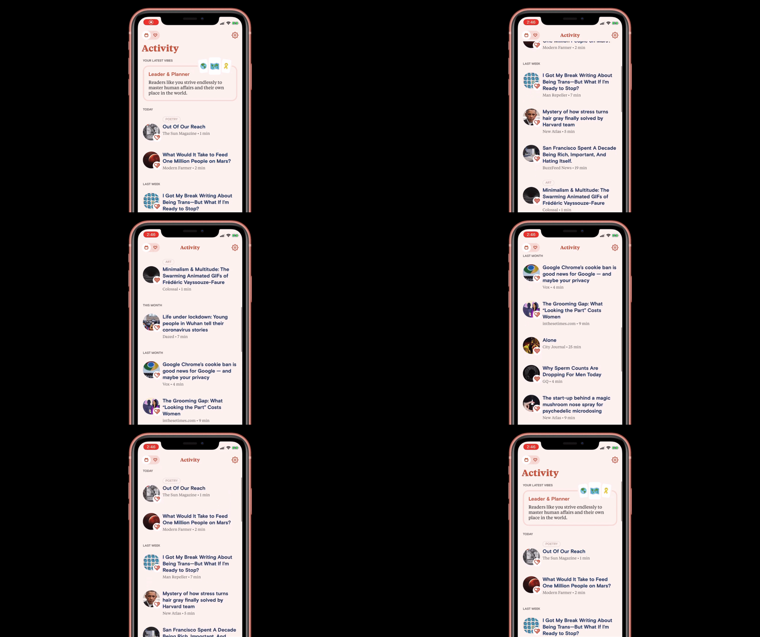
In the tab, we show them a full history of the articles they’ve read along with how much we think they loved it. We also expose what ‘vibe’ they’re giving us based on their reading history.
A quick note about feedback: we intentionally didn’t include negative feedback because we learned that saying you “don’t like something” puts a lot of pressure on a recommendation system to honor that and not show you anything like it in the future. We focused on four degrees of positive feedback (“alright”, “good”, “great”, and “love”) and one option to “ignore” the read instead to match user expectations.
Vibes
Vibes — also, a mood or atmosphere — are what Tonic thinks you’re giving off based on your reading history, likes and dislikes. Your vibe changes as you interact with different kinds of reads every day. We base the vibe descriptions on Japanese RPG archetypes and create fun descriptions of each user so they can feel seen by the app.
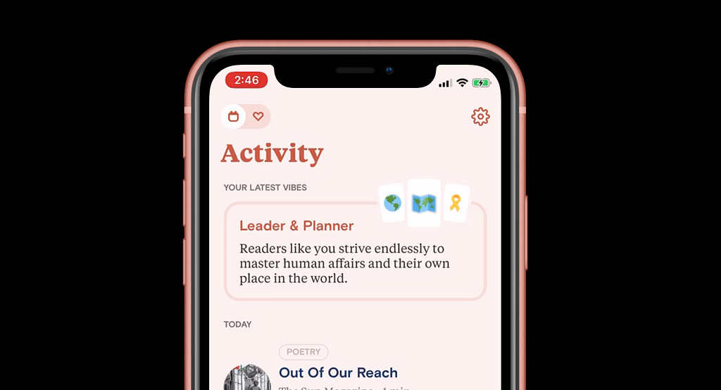
My vibe is “Leader & Planner” which means readers like me “strive endlessly to master human affairs and their own place in the world” — 😏 not too shabby!
We noticed our users really love this feature as it provides an opportunity to understand why they’re being recommended their reads and how that changes over time.
Control
Transparency isn’t enough to create a Sensible product. It must also be controllable, which means that at any point users can correct what the algorithms got wrong.
We give people a couple opportunities to do this in Tonic:
Rating
As I mentioned before, Tonic assigns an automatic rating to every read based on your activity. However, if we get it wrong, people can long-press on any read article to correct the automatic rating. This will steer future recommendations to something more aligned with their tastes.
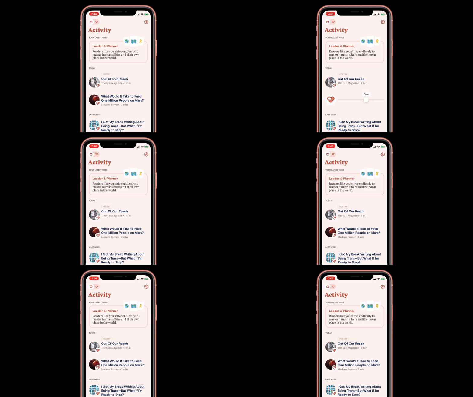
This core interaction (long press to rate) is something present everywhere in the app: any time you see an article you’ve read, we expose the app’s rating and every user has the opportunity to correct that with the same interaction throughout the app.
Swap
Rating is great for articles our users have read and decided they don’t love as much as Tonic thinks they do (or maybe even more!), but what about when Tonic gets it wrong right away and they don’t even want to read the article? They can use the same interaction: long press to swap a recommendation.
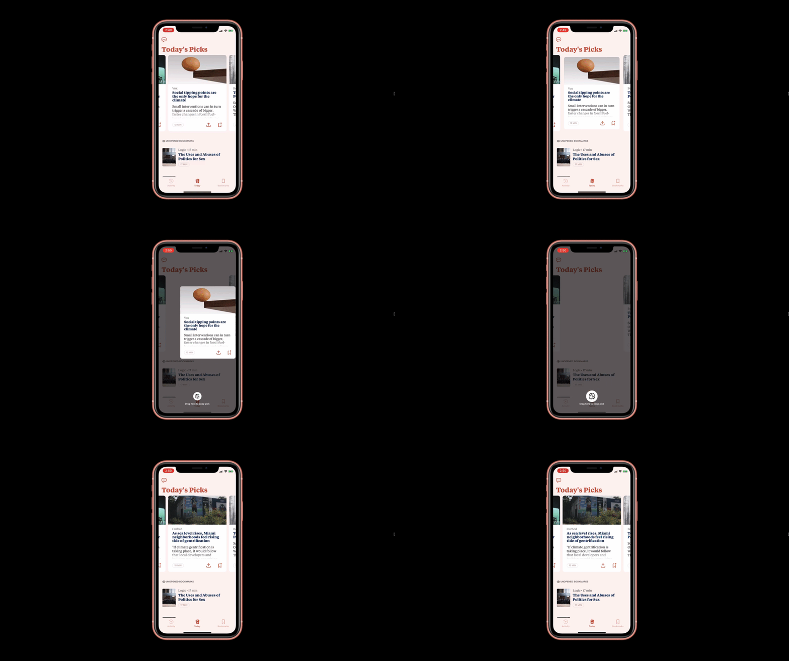
This was a particularly interesting challenge because we wanted to avoid encouraging people to use this mechanic to get into a rabbit hole of reading more than 5 articles per day. After all, Tonic should feel finite and not like an endless stream of stuff to read (see Mindful principle above).
We considered tapping a button to get five new articles totaling ten articles, or replacing all five articles for a new set of five. We settled on individually swapping one article at a time to encourage a thoughtful interaction with the app that gave each piece a time to shine.
Tonic is a small app and a proof of concept for what a Sensible product could look like. Some of these features may sound familiar, but when combined together and designed simply into the foundation of your product, we believe they deliver something entirely new. There are still many unanswered questions, like how to scale these principles to a product that serves millions of people, how do you build a Sensible social platform, and transferring your recommendation profile across devices.
At Canopy, we are exploring these questions and invite others to explore them with us. We’ve already started to see other products adopt Sensible principles — perhaps unknowingly — and can’t wait to see what would be possible if we made this a joint effort across the design industry.
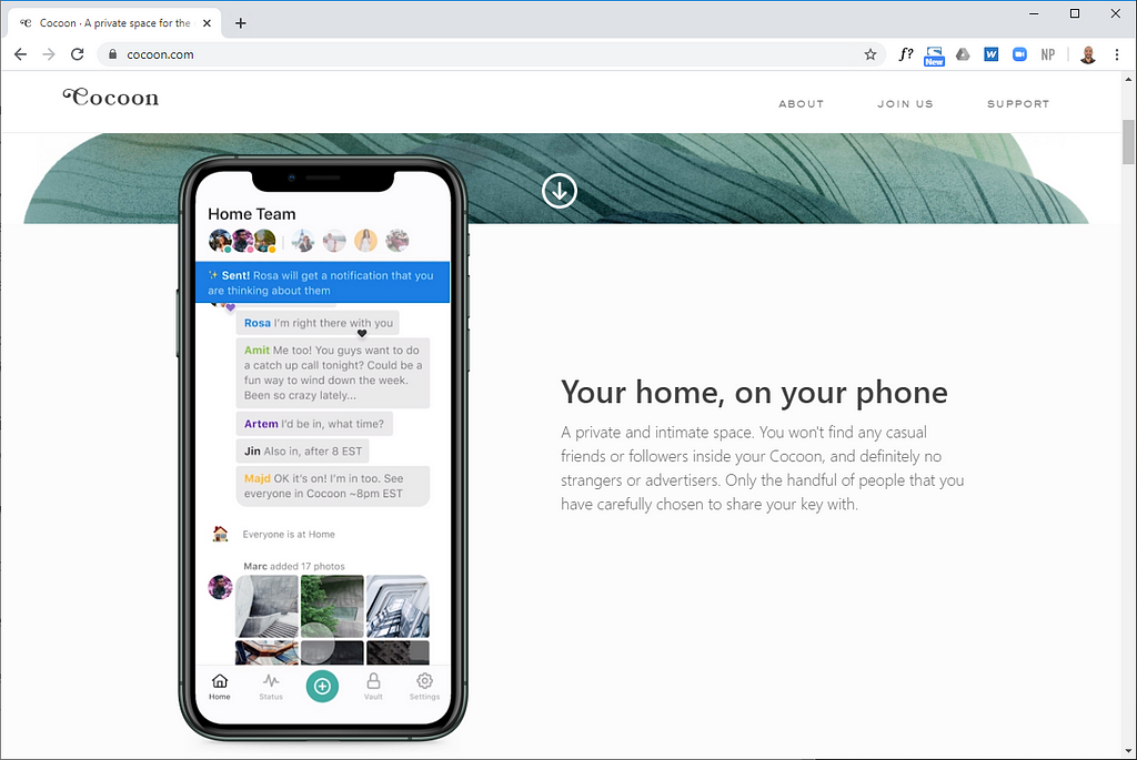
Cocoon is a private social network for families that keeps you in control of the experience.
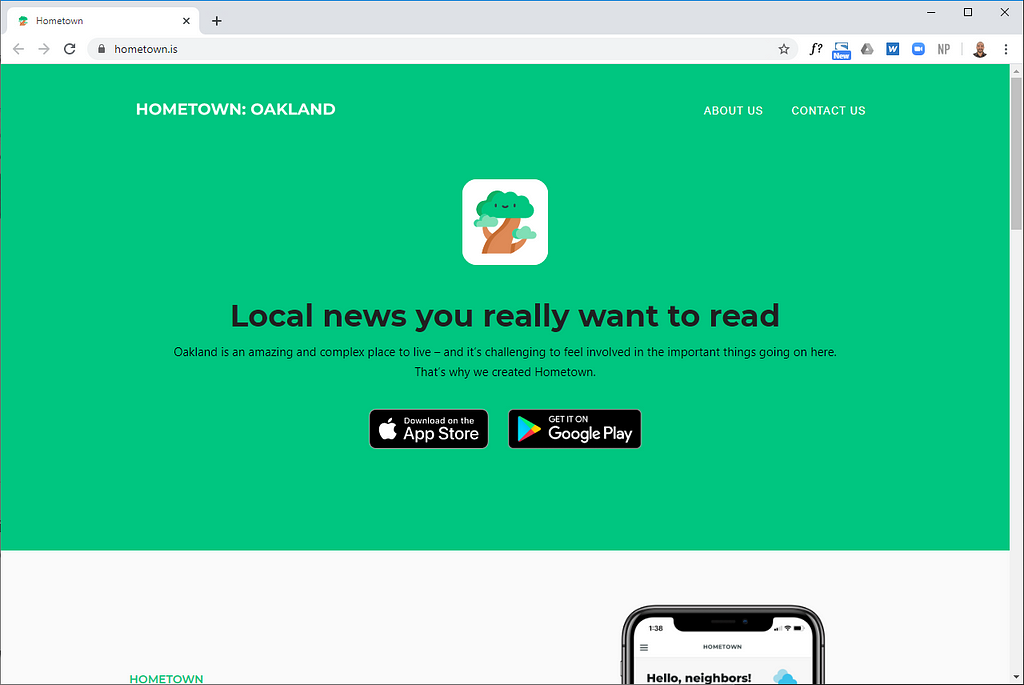
Hometown delivers local news while keeping your data private.
Hey promises to build a Sensible email client.
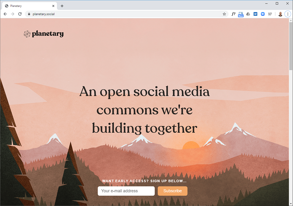
And others like Planetary are attempting to build a Sensible social platform.
As I sit here writing about tHe FuTurE Of DeSiGn, I hope you consider a future that is more data-prudent, mindful, transparent, and controllable.
Get new notes by email
I write about design, technology, and the things I’m figuring out along the way.